Verizon MyPlan
content & UX
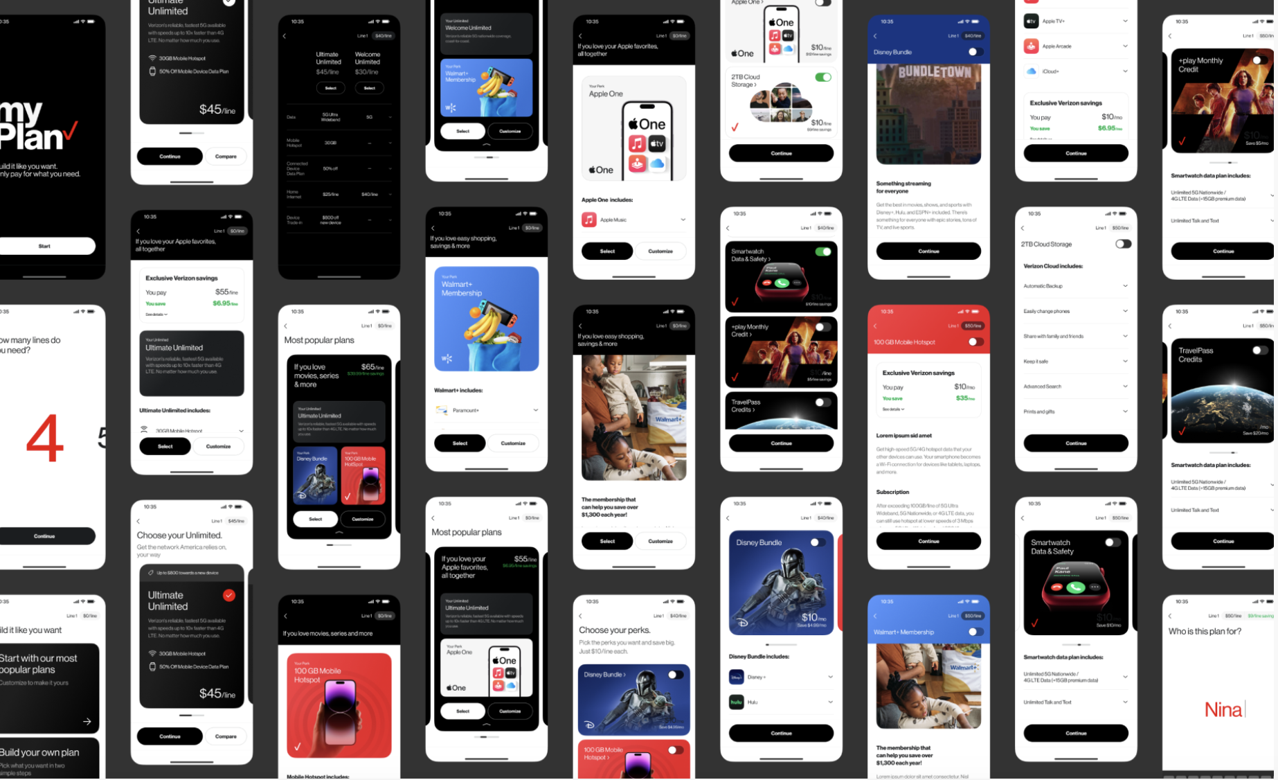
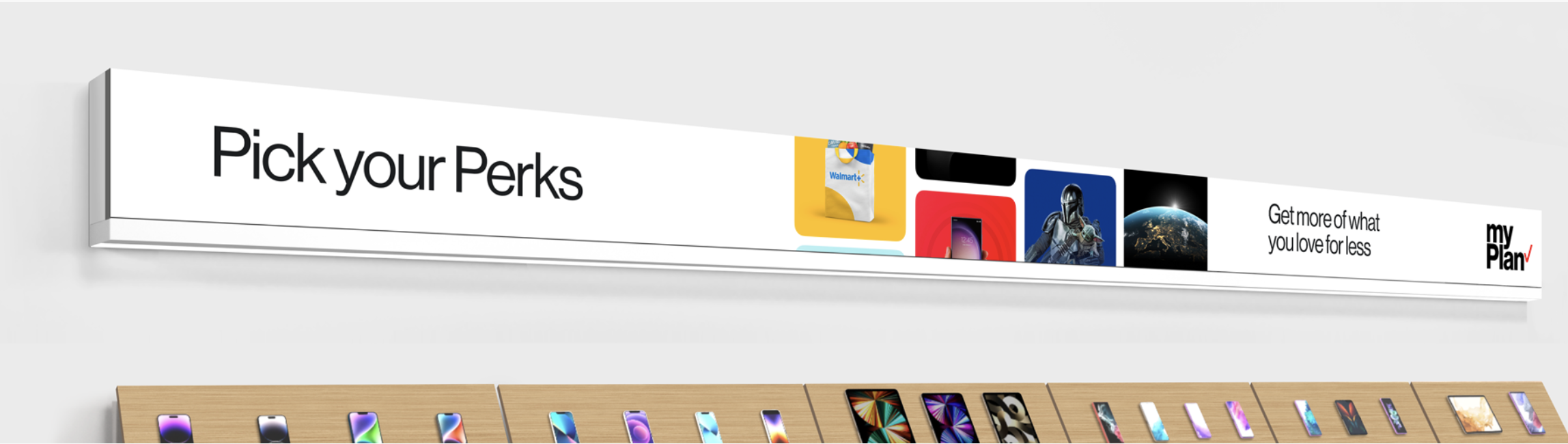
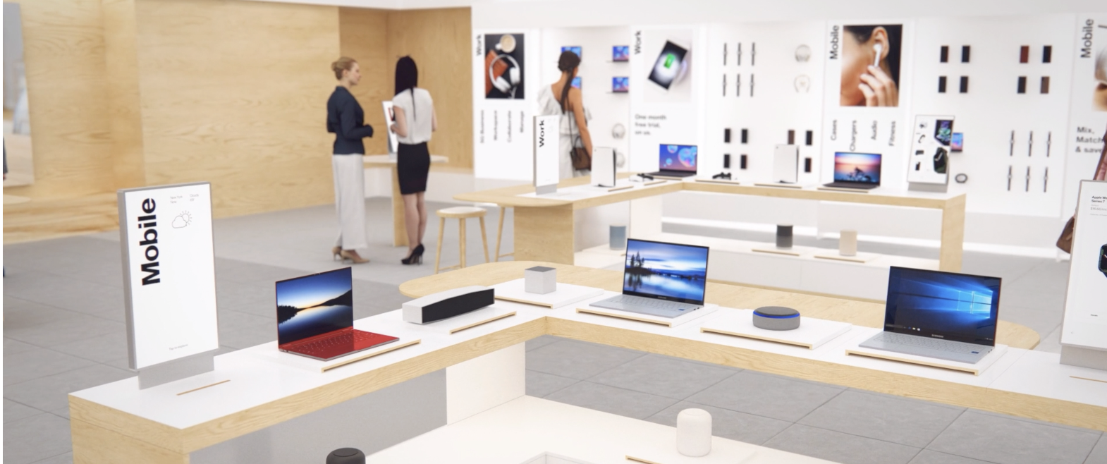
Verizon introduced MyPlan to give customers more choice and control over their wireless service, with flexible plan options and perks like Disney+ and Apple One. Our team brought the offering to life across in-store touchscreens, interactions with store representatives and the My Verizon app. We created a connected experience that revealed information progressively, made complex decisions easier and kept the journey consistent from exploration through purchase and setup.
Challenge
Make a complex purchase feel manageable
Choosing wireless service means making a lot of connected decisions, from devices and plans to trade-ins, promotions and entertainment perks. Customers needed enough information to feel confident, but not so much that the experience became overwhelming.
They also needed the flexibility to explore on their own or make decisions with a store representative. The experience had to support both paths and make the transition between them feel natural
Role
Shaping the experience and the system behind it
As a Senior UX Writer, I partnered with experience designers, visual designers and Verizon’s internal team from early strategy through prototype delivery. I helped:
Turn research and customer needs into content principles
Shape user flows, information hierarchy and key decision points
Simplify language around plans, products, perks and setup
Create reusable patterns for navigation, guided questions, comparisons, recommendations and calls to action
Establish consistent progress, confirmation and instructional messaging
Adapt content across devices, products and stages of the retail journey
Refine recommendations through stakeholder, leadership and legal review
Together, these patterns created a consistent experience while allowing the content to respond to different customer needs and touchpoints.
Insight
Customers need clarity to make confident decisions
Help me understand
Simplify complex information so I can make a confident decision.
Make it relevant to me
Recognize my needs and personalize the experience around what matters.
Let me stay in control
Provide clear guidance while giving me the freedom to explore and adjust my choices.
Show me what’s possible
Create engaging moments that help me discover new products, benefits and possibilities.
Strategy
Turn the interface into a guided conversation
I collaborated with design to treat the interface as a conversation rather than a product catalog.
The content first helped customers identify what mattered to them. It then introduced relevant products, plans and perks at the moments they were most useful. This progressive approach reduced cognitive load while preserving access to the details customers needed before committing.
Across the journey, the content was designed to:
Orient customers before asking them to act
Break up complicated decisions into easy-to-follow steps
Translate technical jargon into benefit-focused language
Keep customers aware of their choices and progress
Support natural conversations between customers and representatives
Provide clear next steps from exploration through setup
Designing key moments
Getting oriented
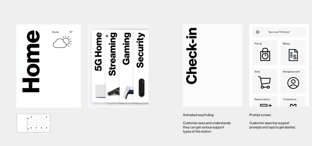
The kiosk’s opening screen gave customers a clear overview of available services and helped them choose where to begin. Simple wayfinding and focused prompts guided them into the right flow.
The strategy balanced self-service with personalization. Customers could communicate their needs and begin simple tasks independently, reducing long lines and demand on store representatives. When assistance was needed, representatives had more context to provide focused, relevant support.
Building a plan
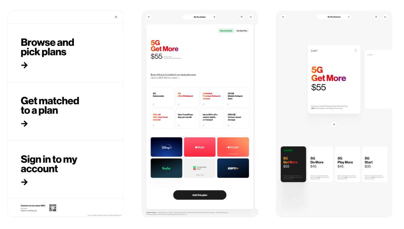
From the kiosk’s main screen, customers could enter the Plan Builder to explore Verizon’s plans and find the option that best fit their needs.
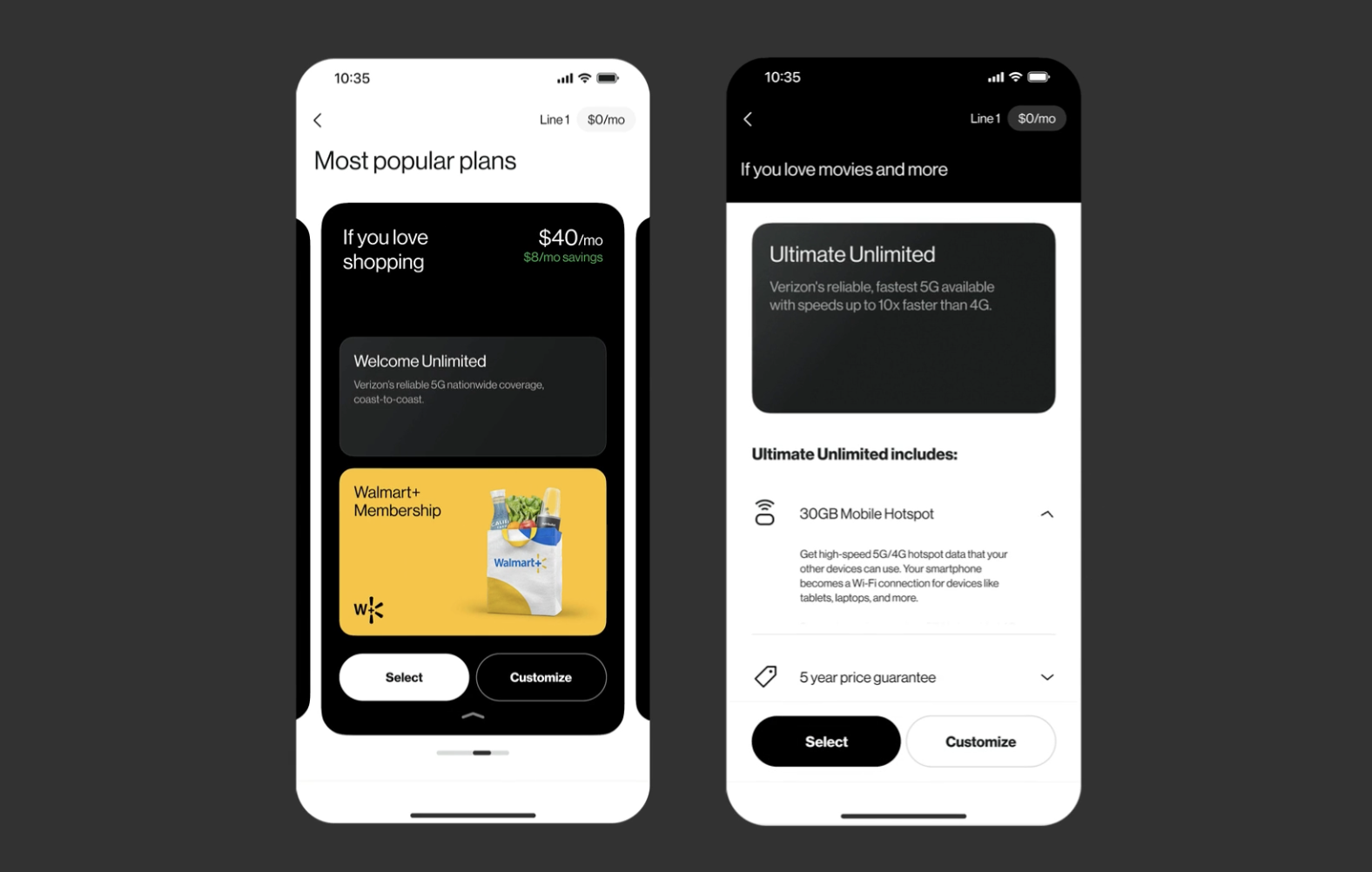
Customers could browse independently, get matched with a plan or sign in for personalized options. Clear, consistent plan cards made pricing, features and extras easier to understand and compare.
Putting customization at the center
Customers could tailor each line to the individual needs of everyone on their account and see how those choices affected the monthly cost.
Clear labels and pricing made it easier to review, compare and adjust the complete plan before moving forward.
Offering guidance
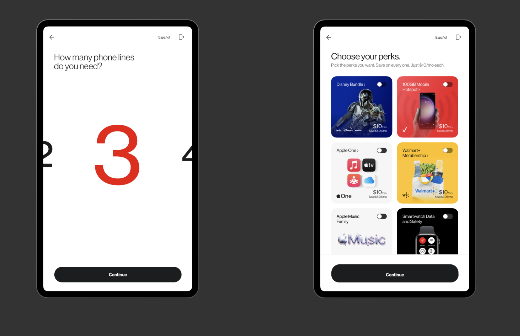
Customers who weren’t sure where to start could answer five quick questions and get matched with a plan that fit their needs.
This helped customers handle more on their own, cut down on wait times and freed up store representatives to support people who needed help.
Highlighting partner benefits
Entertainment benefits like Disney+, Apple Music and ESPN+ added value to Verizon’s plans, but they also gave customers more information to sort through.
We made perks easy to scan alongside the plan’s core features, then let customers explore additional details when they wanted them. This kept the experience focused while making the full value of each plan easier to understand.
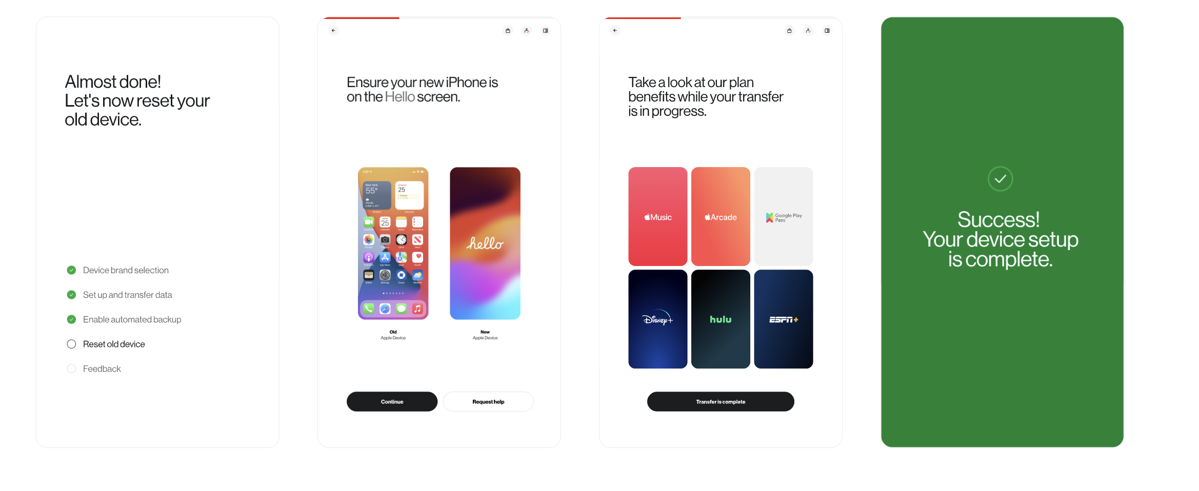
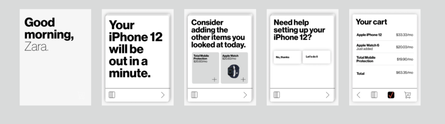
The same step-by-step approach used to simplify plan selection also guided customers through device activation and setup.
Clear progress indicators, direct instructions and reassuring confirmation messages helped customers complete more of the process independently.
This also carried the experience beyond the purchase, giving customers confidence that their new device was ready to use.
Extending guidance through setup
Bringing the experience to life
Making the experience work across the store took close collaboration with UX, visual design, technology, business, partner and legal teams.
As the work moved from early flows to high-fidelity prototypes, I refined the content around customer needs, technical realities and business requirements. I kept the language clear and consistent across devices, worked through stakeholder feedback and adjusted recommendations as the team prioritized features for launch.
The result was a connected experience that supported customers from their first interaction through plan selection, purchase and device setup.